Most Iconic Brand Uniforms

Perhaps the most embarrassing mistake you can make while out shopping is tapping someone on the shoulder, asking them if they could check out the back and see if they ‘have this in a size small’, only to discover they don’t actually work there. We are all guilty of this, and it’s an easy mistake to make due to the fact most shops don’t employ a strict uniform policy, or one at all for that matter.
Some brands have uniforms that we can almost instantly envisage when we think of them. This is mainly the case because the uniform will have the company logo emblazoned on it and will be designed in the business’ colours, but throughout the UK which uniforms do we consider to be the most iconic?
Here, we examine the UK’s most stand out brand uniforms and identify what has helped them become so recognisable.
McDonalds
The big ‘M’ shaped yellow crest positioned on the left hand-side of the chest can only mean one thing — I’m loving it. The new design which was launched in 2017 is more of a casual option than has been used in the past. In the earlier days of ‘Maccy D’s’, as it is affectionately known, a plain white uniform with a beret like-hat, that made their staff bear more resemblance to that of a Royal Navy Officer, was the chosen option. Then came the pin stripe alternative, replicating the look of their clown mascot Ronald. A variety of changes have taken place in regard to McDonalds clothing over the years, however the one constant which has remained, is the yellow logo which has successfully made it, in our eyes, iconic.
Centre Parcs
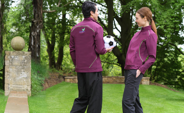
Regarded as the traditional British getaway, Centre Parcs open its gates for the very first time in July 1997 at Sherwood Forest in Nottingham. Now, the holiday company has five sites across the UK and it is opening a sixth site in Longford, Ireland, in 2019. Five years ago, as the leisure brand focused its efforts on opening up site number five at Woburn Forest, they decided that it was time for a revamp of their uniform, for a more on-brand look— it needed to convey leisure but also blend in with the backdrop presented by the woodland. The lavender purple staff uniforms, we designed, took vivid inspiration from the palette of berry colours found in the forest, while the bright green hints which run through represent the essence of the plants.
Qantas
Okay, so perhaps this isn’t the uniform which the company uses now, but back in 1974, the Australian airline made what could be described as a particularly rash decision, when, with the help of Italian designer Mr Pucci, they launched their new uniforms. Qantas broke any form of traditional norm and launched a variety of uniforms in copious amounts of colours, with no justification as to why each existed as it did. A mustard blazer was paired with tawny coloured trousers, while the women sported green cardigans and floral dresses. The Italian’s daring attitude proved to be that of the Australian company’s gain, as the uniforms were particularly well received and will go down in history. Now, in 2019, a sleeker black and red option is worn by staff as they jet across the globe, however, there is nothing to say the outlandish 70’s choices will not return.
NHS
One thing we can all agree on celebrating is the hard-work and persistence of the National Health Service, which has established it as one of the best health-care systems in the world. In 2018, the staff at Trafford Hospital pulled together to celebrate the 70th anniversary of the NHS’ inauguration. It should come as no surprise that back in 1948, when Aneurin Bevan assisted the development of the health service, the uniforms were effectively we laid our eyes on during the popular BBC series, Call the Midwife. White aprons topped a blue dress with a thick white collar, which has remained relatively unchanged over the years — if it’s not broke don’t fix it.
Eurostar
Back in May 1994, the longest undersea section in the world was opened. Eurostar was established to manage and own the channel crossing that allowed travelers to commute from London to major European cities, Amsterdam, Brussels, and Paris. A massively unique travel system requires a uniform of similar stature and so, the iconic yellow Eurostar colour was intertwined into clothing. Although the colour implementation is subtle, it is clever and replicates everything the Eurostar is about — they invested heavily in a revamp of the uniform following upgrades to their trains and the style match can easily be seen in the smooth design.
Here, we’ve run through just some of the UK’s most iconic uniforms, but we’re fairly convinced some popular choices will be pinging around in your own head! Alongside creating a sense of cohesion among staff, uniforms can be a great way of displaying a positive image to your customers. No doubt in the next few years we will be exposed to a variety of new updates to uniforms, but who’ll join the list of legends is yet to be seen.


